Table of Contents Previous Next Index

Sugar Express User Guide

Version 5.5.0 Beta 2


Chapter 3 Using Sugar : Dashboard Module

Dashboard Module
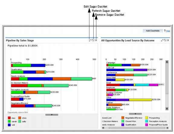
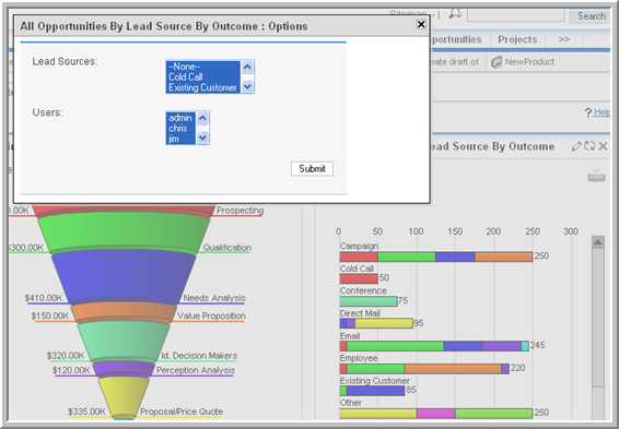
Use the Dashboard Module to view and manage charts based on custom and predefined reports. A chart is a graphical display of report output
Customizing Predefined Charts
Sugar provides several charts based on predefined reports. You can use these charts to view sales and opportunities for your organization. Each distinctively colored area on a chart is linked to the data set that it represents. You can click any colored area to drill down to the underlying data. To enhance performance, the system does not automatically recalculated chart data each time you click the Dashboard tab. To recalculate the data source for a specific chart, click the associated Refresh icon above the chart.
You cannot delete predefined charts but you can edit them to suit your requirements.
Sugar provides the following predefined charts:
Opportunities by Lead Source. A horizontal chart of that displays the proportion of total sales opportunities for each lead source.
My Closed Opportunities. A gauge chart that displays how many of your opportunities have closed to date. The phase indicates the percentage of opportunities that have closed.
All Opportunities by Lead Source by Outcome. A horizontal stacked bar chart that displays total opportunities for each lead source. Each bar is made up of multi-colored segments which represent the outcome proportions for that lead source.
Outcome by Month. A stacked bar chart where each bar displays the total sales pipeline for each month. Each bar is made up of multi-colored segments which represent the outcome proportions for the pipeline in that month.
Leads By Lead Source. A horizontal stacked bar chart where each bar shows the value of potential sales at each stage of the sales pipeline.
My Forecasting. Compares your sales quota against the committed amount and the actual amount.
Campaign ROI. Displays a campaign’s return on investment.
To customize a predefined chart
1.
On the Dashboard home page, click the Edit icon on the top right corner of the chart.
A dialog box displays the details of the report on which the chart is based.
2.
The chart reflects the changes to the report.
3.
To manage charts
To ensure that the chart is displaying the latest data, click the Refresh icon at the top right-hand corner of the chart.
Select the chart title and drag and drop the chart at the desired location.
To remove a chart from the dashboard, click the Delete icon at the top right-hand corner of the chart.
To add a chart back on the dashboard, click Add Sugar Dashlet. The Add Sugar Dashlet window displays a list of pre-defined charts. Click a chart to add it as a Sugar Dashlet on the Dashboard.
To copy a chart for inclusion in a document, take a screen copy (such as by using Alt-PrtScn on Windows) and then crop the captured image in an image editor such as Photoshop.

Table of Contents Previous Next Index

Copyright 2004-2009 SugarCRM Inc.
Sugar Express License